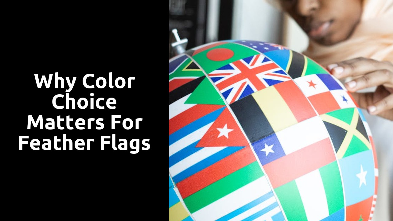
Why Color Choice Matters for Feather Flags
Competitive Advantage Through Colour Differentiation
Customers are naturally drawn to vibrant and visually appealing displays, making the choice of colours for feather flags a crucial element in attracting attention. Steering away from the commonplace colour choices of competitors can provide a distinct edge in capturing the interest of passersby. By selecting a unique colour scheme, a business can carve out its own visual identity within a sea of similarly designed flags, ultimately setting itself apart and gaining a competitive advantage.
A standout feather flag - enriched with a carefully selected colour palette - can act as a beacon amidst a bustling crowd, guiding potential customers towards a business. Embracing bold and eye-catching colours not only helps in garnering immediate attention but also leaves a lasting impression on viewers. In essence, colour differentiation in feather flags can serve as a powerful marketing tool, effectively positioning a brand as innovative, dynamic, and unmissable in a crowded marketplace.
Standing Out Among Competitors Using Unique Colour Schemes
In the realm of advertising and branding, the significance of selecting unique colour schemes cannot be overstated. The colours you choose for your feather flags can greatly impact how effectively your message stands out amongst competitors. By opting for distinctive and eye-catching colour combinations, you have the opportunity to capture the attention of potential customers and create a lasting impression. In a sea of standard colours commonly used in advertising, choosing a unique palette can set your brand apart and make it more memorable in the minds of consumers.
A bold and unconventional colour scheme can help your feather flags break through the visual clutter and noise of the market, allowing your brand to shine brightly and attract attention. When competitors are using similar colours or following industry norms, employing a unique colour scheme can differentiate your brand and give you a competitive edge. By standing out from the crowd with your choice of colours, you demonstrate creativity and innovation, which can help to position your brand as a leader in the industry.
Practical Considerations for Colour Selection
When it comes to selecting colours for feather flags, practical considerations play a crucial role in ensuring the effectiveness of the display. One key aspect to keep in mind is the contrast between the background colour and the text or graphics on the flag. Opting for colours that stand out against each other will enhance legibility and visibility, especially from a distance. Bold colour choices can help attract attention and make the message on the flag easily readable, even in crowded outdoor settings.
Furthermore, considering the environmental factors where the feather flags will be displayed is essential. Understanding the lighting conditions, whether it's natural daylight or artificial lighting, can impact how colours appear. For instance, bright colours may look different in direct sunlight compared to shaded areas. By anticipating the surroundings where the flags will be placed, you can choose colours that maintain their vibrancy and clarity under various lighting situations, ensuring that your message shines through effectively.
Ensuring Legibility and Visibility from a Distance
To ensure that feather flags are easily readable and visible from a distance, selecting appropriate colours is essential. Bright and bold hues such as red, yellow, and orange can enhance visibility, especially in outdoor settings where flags may be subject to various lighting conditions. These colours can catch the eye quickly, making the message on the flag easily discernible even from afar.
Contrasting colours can also play a crucial role in improving legibility. Using combinations like black text on a white background or vice versa can create a high level of contrast that aids in readability. Additionally, avoiding colour combinations that may blend together or cause visual confusion is important for maintaining clarity when communicating with viewers from a distance. By carefully considering colour choices, businesses can ensure that their feather flags effectively convey their message to a wide audience.
Colour Harmony and Design Cohesion
Using a harmonious colour scheme is crucial for creating cohesive and visually appealing feather flags. When selecting colours for your flag design, it is essential to consider how different hues work together to convey a unified message. By choosing colours that complement each other, you can achieve a balanced and aesthetically pleasing look that attracts attention and leaves a lasting impact on viewers.
Incorporating complementary colour palettes not only enhances the overall design of your feather flag but also helps in reinforcing your brand identity. When colours are carefully coordinated, they can evoke specific emotions and associations that resonate with your target audience. By maintaining consistency in your colour choices across all marketing materials, you can strengthen brand recognition and establish a strong visual identity that sets you apart from competitors.
Creating a Harmonious Look with Complementary Colour Palettes
When it comes to designing feather flags, incorporating complementary colour palettes can work wonders in creating a harmonious and visually appealing look. By strategically combining colours that sit opposite each other on the colour wheel, such as blue and orange or purple and yellow, you can achieve a balanced and eye-catching design. Complementary colours naturally enhance each other when placed together, attracting attention and conveying a sense of unity in your flag's overall appearance.
Incorporating complementary colour palettes in your feather flags not only adds visual interest but also helps in making your message even more impactful. Whether you're promoting a sale, event, or business, using complementary colours can elevate the design and draw in viewers effectively. Remember to pay attention to the contrast and balance between the colours to ensure readability and coherence in your flag design. By embracing the power of complementary colours, you can create a harmonious and memorable look that sets your feather flags apart.
FAQS
How does color choice impact the effectiveness of feather flags?
The color choice of feather flags can significantly impact their effectiveness in attracting attention and conveying messages to the audience.
Can using unique color schemes provide a competitive advantage for feather flags?
Yes, using unique color schemes can help feather flags stand out among competitors, making them more memorable and distinct.
What practical considerations should be kept in mind when selecting colors for feather flags?
When selecting colors for feather flags, it is important to ensure legibility and visibility from a distance to effectively communicate your message to the target audience.
How can color harmony and design cohesion enhance the overall look of feather flags?
By creating a harmonious look with complementary color palettes, feather flags can achieve a visually appealing design that attracts attention and conveys a cohesive brand image.
Why is it important to consider color harmony when designing feather flags?
Considering color harmony in the design of feather flags is crucial as it helps in creating a unified and visually pleasing look that captures the audience's attention effectively.
Related Links
Why Some Color Combinations Work Better for Feather FlagsWhat Are the Most Popular Color Combinations for Feather Flags?
Feather Flag Color Combinations: A Comprehensive Review
The Ultimate Roundup of Feather Flag Color Combinations