How to Match Feather Flag Colors for Maximum Impact
Enhancing Visibility
Enhancing the visibility of your feather flags is paramount for catching the eye of potential customers. Bright, bold colors are key to ensuring that your flags stand out against various backgrounds, whether it be a busy street or a crowded event. Opt for vibrant shades that can be easily seen from a distance to attract attention effectively.
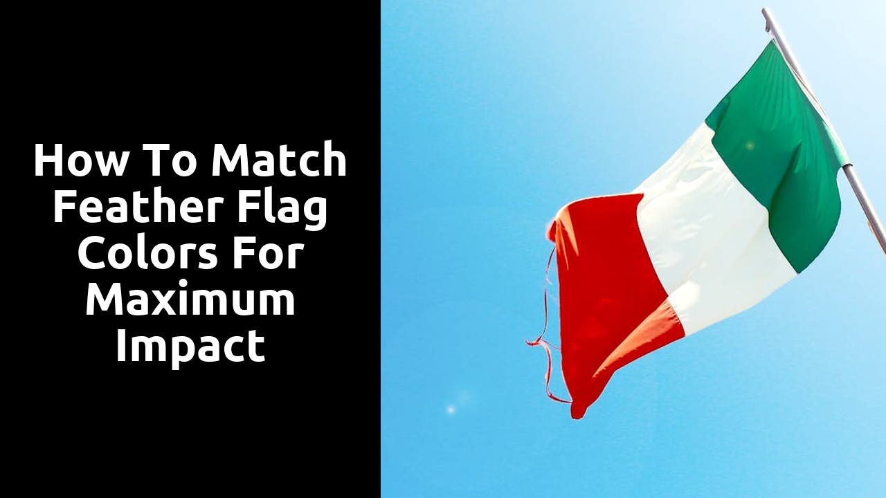
Additionally, consider the environment where your feather flags will be displayed. Choose colours that contrast with the surroundings to make sure your message is easily readable. For instance, a bright yellow flag will pop against a deep blue sky, while a red flag will stand out against a backdrop of green foliage. By strategically selecting the right hues, you can significantly boost the impact of your feather flags and draw in more passersby.
Using HighContrast Colours for Outdoor Marketing
Selecting high-contrast colors for outdoor marketing is crucial in capturing the attention of passersby and potential customers. Vibrant hues like bright reds, yellows, and blues against a stark white background can create a bold and eye-catching display that stands out even from a distance. These striking color combinations are effective in drawing people's gaze towards your feather flag, making it a powerful tool for promoting your business or event.
When choosing high-contrast colors, consider the environment in which your feather flag will be displayed. Colors that pop against a clear blue sky may not have the same impact against a busy cityscape or a lush green park. By understanding the surroundings, you can tailor your color choices to ensure maximum visibility and effectiveness. Experimenting with different combinations and observing how they interact with the outdoor setting can help you find the perfect high-contrast palette to make your feather flag truly stand out.
Evaluating Colour Combinations
When evaluating colour combinations for your feather flags, it is crucial to consider the overall tone you wish to convey. Bold and vibrant colours like red, yellow, and orange can evoke energy and excitement, making them perfect for attracting attention in crowded outdoor spaces. On the other hand, softer pastel shades such as light blue, pink, and lavender can create a more calming and approachable atmosphere, ideal for businesses aiming for a more gentle impact.
Another key aspect to consider when evaluating colour combinations is the contrast between hues. High-contrast pairings, such as black and white or navy blue and bright yellow, can enhance visibility from a distance and ensure that your message stands out against any background. Experimenting with different colour combinations and observing how they interact under various lighting conditions can help you determine the most effective palette for your feather flags.
Testing Colour Pairings for Maximum Impact
When testing colour pairings for maximum impact on feather flags, it is crucial to consider the vibrancy and saturation of the colours chosen. Select hues that are bold and eye-catching to ensure that your message stands out prominently against the backdrop. Experiment with contrasting colours to see which combinations create the most visual impact for your specific marketing goals.
Furthermore, pay attention to the emotional response that different colour pairings evoke in viewers. Warm colours like reds, oranges, and yellows can convey energy and excitement, while cool tones such as blues and greens may evoke feelings of calmness and trust. By strategically combining colours that align with the emotions you want to elicit, you can effectively enhance the overall impact of your feather flag display.
Avoiding Colour Clashes
When it comes to designing feather flags for your business or event, avoiding colour clashes is essential to maintain a professional and visually appealing look. The key to preventing colour clashes is to ensure that the hues you choose complement each other harmoniously. Opt for colours that are in the same colour family or choose colours that are opposite each other on the colour wheel for a striking contrast.
Additionally, consider the psychology of colours and how they can impact the perception of your brand. Warm colours like reds, oranges, and yellows can evoke feelings of energy and excitement, while cool colours like blues and greens create a sense of calm and trust. By carefully selecting and combining colours that align with your brand message, you can effectively prevent colour clashes and create a cohesive and impactful design for your feather flags.
Ensuring Harmony Between Different Tones
When considering colour combinations for feather flags, it is crucial to ensure that there is harmony between different tones used. This harmony can be achieved by selecting colours that complement each other rather than clash. For example, pairing warm tones like reds and oranges with cool tones like blues and greens can create a visually appealing contrast that draws attention without causing a jarring effect.
Another way to ensure harmony between different tones is to stick with a consistent colour scheme throughout your design. By limiting the number of colours used and sticking to a cohesive palette, you can create a more polished and professional look for your feather flags. This consistency will help tie the design together and make it more visually appealing to your audience.
FAQS
How can I enhance the visibility of my feather flags?
To enhance the visibility of your feather flags, consider using high-contrast colours that stand out against the background.
How do I evaluate colour combinations for my feather flags?
When evaluating colour combinations for your feather flags, test different pairings to determine which ones have the maximum impact on visibility and attractiveness.
How can I avoid colour clashes when selecting colours for my feather flags?
To avoid colour clashes, ensure harmony between different tones used in your feather flags to create a cohesive and visually appealing design.
Why is using high-contrast colours important for outdoor marketing with feather flags?
Using high-contrast colours for outdoor marketing with feather flags is important as it helps in making the flags more visible from a distance and attracting attention effectively.
What should I do to ensure harmony between different tones in my feather flag design?
To ensure harmony between different tones in your feather flag design, carefully select colours that complement each other and create a cohesive overall look for maximum impact.
Related Links
How to Choose the Right Feather Flag ColorThe Ultimate Roundup of Feather Flag Color Trends
Review: The Best Color Combinations for Feather Flags
Top 10 Stunning Color Combinations for Feather Flags
A Historical Look at Orange and Pink Feather Flags