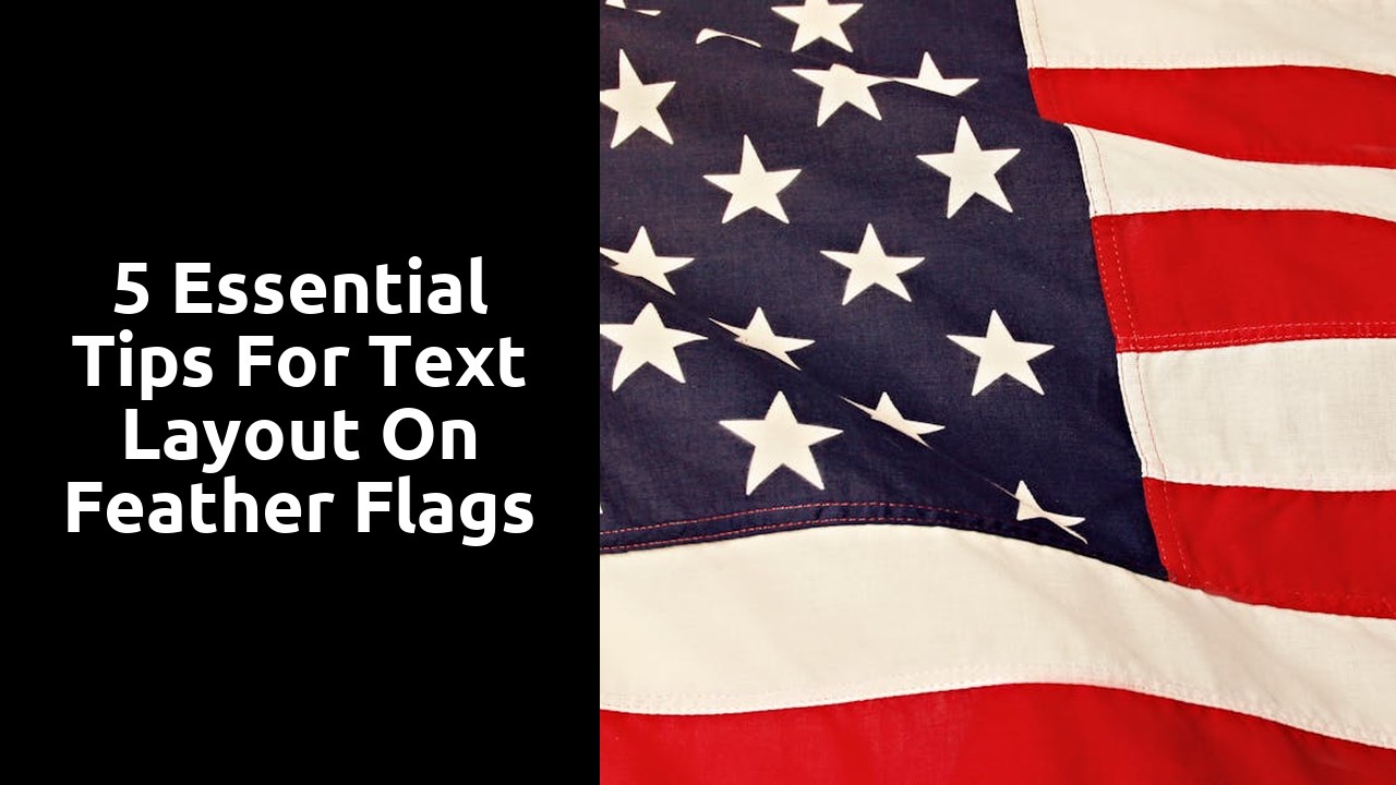
5 Essential Tips for Text Layout on Feather Flags
Consistency in Formatting
Consistency in formatting is crucial for ensuring that your feather flags convey a professional and cohesive message to your audience. By maintaining a uniform style throughout your text layout, you create a sense of harmony that helps in guiding viewers' eyes seamlessly across the content. This consistency also establishes a visual identity for your brand, making it easier for customers to recognise and remember your messaging.
To achieve consistency in formatting, pay attention to elements such as font styles, sizes, colours, and spacing. Select a specific font type for headers, subheaders, and body text, and stick to these choices throughout your design. Additionally, establish a colour palette that complements your brand's colours and use it consistently across all elements of the text layout. By ensuring that every aspect of your feather flag design follows these guidelines, you can create a cohesive and visually appealing display that effectively communicates your message.
Creating a Unified Look
Creating a unified look on your feather flags is crucial for capturing the attention of your audience effectively. Consistency in design elements such as colours, fonts, and imagery helps in conveying a cohesive message that is easily identifiable. By sticking to a particular colour scheme and font set throughout your flag design, you can ensure that your message is clear and visually appealing.
Another way to achieve a unified look is by maintaining a balance in the use of text and visuals. Avoid overcrowding your flag with text, as this can overwhelm viewers and dilute the impact of your message. Instead, focus on incorporating a good mix of images, logos, and concise text that work harmoniously together to communicate your key points. Remember, less is often more when it comes to creating a visually cohesive design that resonates with your target audience.
Bullet Points and Lists
When it comes to designing feather flags, incorporating bullet points and lists can significantly enhance the visual appeal and readability of the text layout. These concise and structured formats help in breaking down information into easily digestible chunks, making it easier for viewers to absorb key messages at a glance. Whether you are highlighting product features, showcasing promotions, or communicating key details, using bullet points and lists can make your content more engaging and accessible.
Bullet points are particularly effective in drawing attention to important points or creating lists of items that need to be emphasised. By utilising symbols such as dots, dashes, or arrows, you can create a visually appealing layout that not only enhances the aesthetics of the feather flag design but also improves the overall organisation of information. Lists, on the other hand, allow you to categorise information into distinct segments, aiding in clarity and coherence. Whether you are listing benefits, outlining steps, or presenting options, incorporating lists can help streamline content and improve comprehension for viewers.
Organising Information Effectively
Organising information effectively on feather flags is crucial for ensuring that your message is easily understood by viewers. One way to achieve this is by keeping the layout clean and uncluttered. Avoid overcrowding the flag with too much text or graphics, as this can overwhelm the reader and make it difficult for them to grasp the main message at a glance. Instead, opt for a minimalist approach, using ample white space to separate different sections and make the content visually appealing.
Another important aspect of organising information on feather flags is to consider the flow of information. Arrange your text and graphics in a logical sequence that guides the viewer's eye from one point to the next. This can be achieved by using a combination of headings, subheadings, and bullet points to break up the content into digestible chunks. By structuring your information in a clear and coherent manner, you can help viewers navigate the flag easily and absorb the message effortlessly.
Using Headers and Subheaders
Headers and subheaders play a crucial role in enhancing the readability and overall structure of your content on feather flags. By utilising headers effectively, you can guide the reader through the information provided in a clear and concise manner. Subheaders act as signposts, directing the reader's attention to specific sections, thus making it easier for them to navigate the content.
When creating headers and subheaders, it is important to maintain a consistent style throughout the text. This consistency not only adds to the visual appeal of the feather flag design but also helps in establishing a sense of coherence and professionalism. By using a clear and uniform formatting style for your headers and subheaders, you can ensure that the information is presented in a logical and organised manner.
Structuring Content Hierarchically
Structuring content hierarchically is vital for effectively conveying information on feather flags. By establishing a clear structure, you can guide viewers through the content in a logical and intuitive manner. Begin by determining the most important information that should stand out prominently - this could include key messages, calls to action, or branding elements.
Next, organise the remaining content into subcategories based on their relevance and relationship to the main message. This allows viewers to grasp the information in a structured way without feeling overwhelmed. Employing a hierarchical structure ensures that the main points are easily identifiable at a glance, facilitating quick comprehension and enhancing the overall impact of your feather flags.
FAQS
How important is consistency in formatting when designing text layout on feather flags?
Consistency in formatting is crucial as it helps maintain a professional and cohesive appearance across the flag. It ensures that the text is easy to read and understand for viewers.
How can I create a unified look for text layout on feather flags?
To create a unified look, use the same font style, size, and colour throughout the flag. Consistent formatting will tie the design elements together and enhance the overall visual appeal.
Why are bullet points and lists recommended for text layout on feather flags?
Bullet points and lists help break down information into digestible chunks, making it easier for viewers to scan and comprehend the content quickly. They also add a sense of structure to the flag design.
How can I organise information effectively on feather flags?
Organise information by grouping related content together and using headers and subheaders to indicate different sections. This helps guide viewers through the text and prioritise key messages.
Why is it important to use headers and subheaders in text layout on feather flags?
Headers and subheaders help readers navigate the content easily and understand the hierarchy of information presented on the flag. They improve readability and draw attention to important details.
Related Links
Review of Image Sizing Tools for Feather FlagsA Historical Perspective on Logo Placement in Feather Flags
Why Branding Integration is Essential for Feather Flags
How to Choose the Right Font for Your Feather Flag
What Logo Placement Works Best for Feather Flags